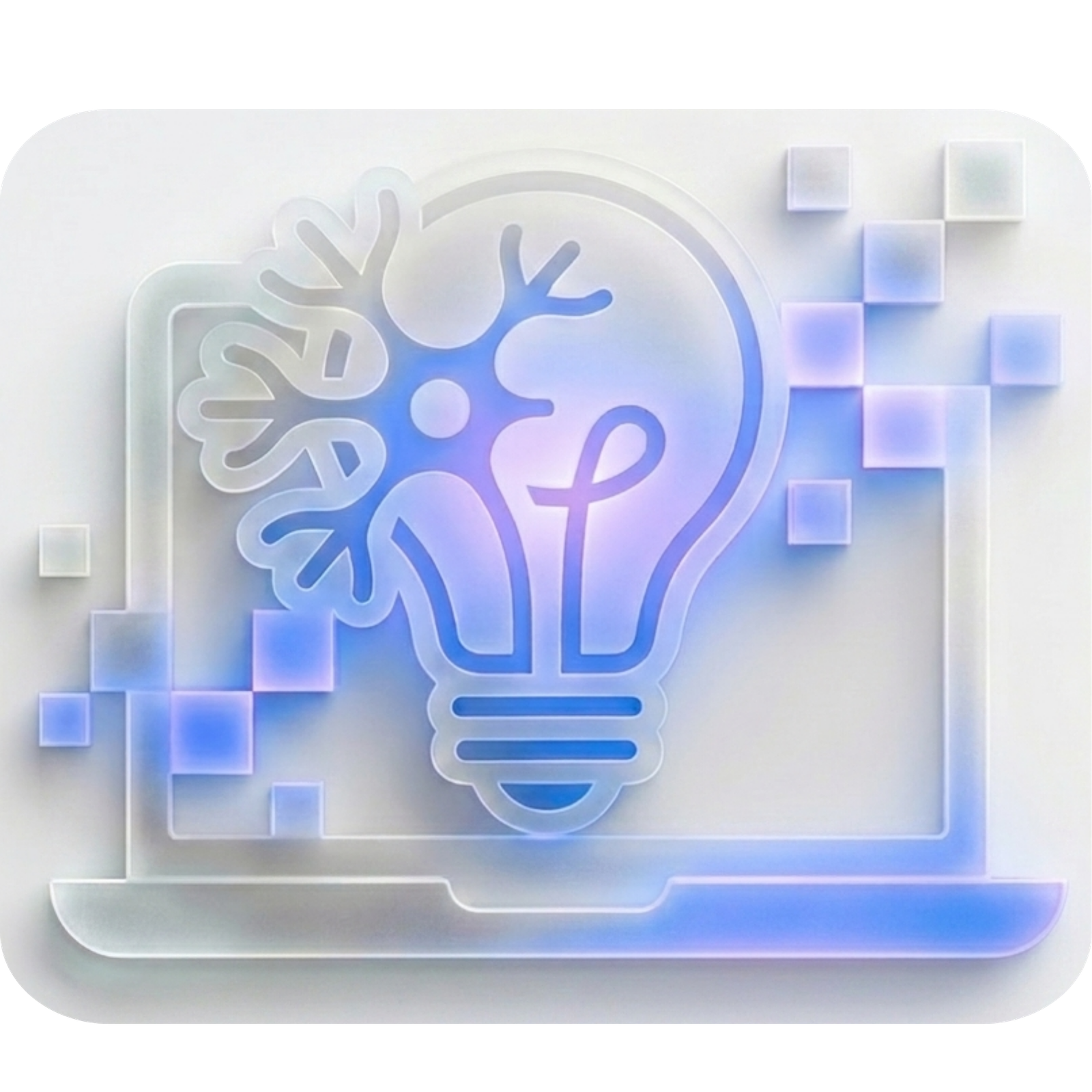
Understanding Modern Glassmorphism
A deep dive into the glassmorphism trend and how to implement it.
If you've browsed high-end digital platforms recently, you've likely noticed interfaces that feel almost weightless. Elements seem to float effortlessly above their backgrounds, distinguished by a translucent, frosted blur. This is modern glassmorphism—a design trend that has evolved from a passing fad into a staple of premium UI/UX design.
Unlike the heavy, skeuomorphic "glass" buttons of the early 2000s, today's glassmorphism is subtle, clean, and highly sophisticated. Here is a deep dive into why this "antigravity" aesthetic works so well and how you can implement it effectively.
1. The Anatomy of the Frosted Glass Effect
True glassmorphism relies on a few core visual principles working in perfect harmony:
Translucency (Background Blur): This is the defining characteristic. By applying a blur to the background behind an element, you create a sense of depth and physical space.
Multi-Layered Approach: Glassmorphic objects look best when they are floating over vibrant or dynamic backgrounds. The background needs to have enough contrast and color variation for the blur effect to be noticeable.
Subtle Borders: To define the shape and give it that tactile, "cut glass" edge, a very thin, semi-transparent white border is often applied.
Vivid Accents: Because the glass elements are inherently subtle, they pair beautifully with glowing neon accents or cinematic lighting effects to draw the user's eye.
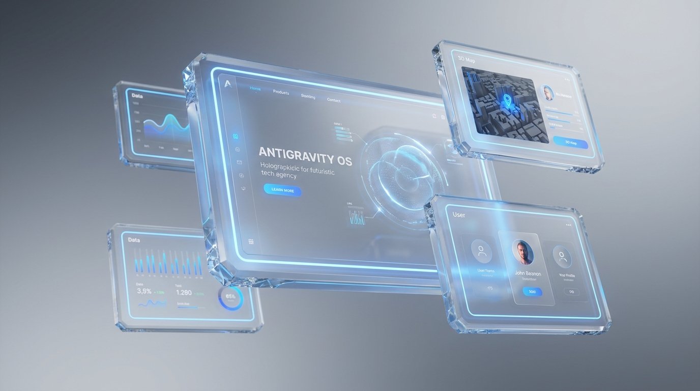
2. Why Light Themes Elevate Glassmorphism
While dark mode has its place, modern glassmorphism truly shines in a carefully crafted light theme. A stark white background can wash out the effect, but a beautifully balanced soft gray gradient provides the perfect canvas.
When you combine a sophisticated light gray base with glowing blue gradients shining through the frosted glass layers, the result is incredibly crisp and professional. The blue accents provide the necessary contrast and visual interest, while the translucent glass softens the overall look, preventing the interface from feeling harsh or sterile. It creates a welcoming, premium environment that feels both futuristic and accessible.
3. Implementing the Effect (The Technical Side)
From a development standpoint, creating this effect has never been easier thanks to modern CSS. The heavy lifting is done almost entirely by a single property: backdrop-filter.
Here is a basic blueprint for a glassmorphic card:
CSS
.glass-card {
/* The translucency */
background: rgba(255, 255, 255, 0.4);
/* The frosted blur effect */
backdrop-filter: blur(12px);
-webkit-backdrop-filter: blur(12px); /* Safari support */
/* The cut-glass edge */
border: 1px solid rgba(255, 255, 255, 0.3);
/* Soft shadow for depth */
box-shadow: 0 8px 32px 0 rgba(31, 38, 135, 0.1);
border-radius: 16px;
}
4. Experimenting with Your Design
To see how these properties interact, simply drop the CSS snippet above into your next project or a browser-based code editor. By slightly adjusting the blur(12px) value or shifting the opacity in the rgba background string, you can drastically change the thickness and feel of the "glass." Pairing this CSS class with a dynamic, glowing background will immediately bring the antigravity aesthetic to life.
The Verdict
When used deliberately, glassmorphism is more than just a visual treat; it establishes a clear visual hierarchy. By utilizing the Z-axis (depth), you help users instinctively understand which elements are primary and which are background context. It’s an elegant solution for modern dashboards, hero sections, and navigation menus.