The Psychology of Color in UI
Why your color choices matter more than you think.
When users land on your website or open your application, they form an opinion in less than 50 milliseconds. While layout, typography, and site speed all play crucial roles, the most immediate subconscious trigger is color.
In UI/UX design, color is never just decoration; it is a highly calibrated form of non-verbal communication. It guides the eye, establishes brand identity, and dictates how a user feels about your digital product before they read a single word. Here is a deep dive into the psychology of color and how to leverage it to build high-converting, premium digital experiences.
1. The Subconscious Language of Color
Every hue carries psychological weight. Understanding these associations allows designers to engineer specific emotional responses:
Red: Creates urgency, excitement, and heightened emotion. It is highly effective for clearance sales or error states, but overuse can cause visual fatigue and anxiety.
Green: Synonymous with growth, success, and finance. It is universally understood as the color of affirmation (think "go" buttons or successful transaction alerts).
Blue: The undisputed king of digital trust. Blue lowers the heart rate, conveying security, stability, and technological sophistication. This is why the world's largest tech, finance, and healthcare platforms rely heavily on blue palettes.
Gray & Neutrals: Gray represents balance, neutrality, and modernism. When used as a foundational background, it provides a clean slate that allows other colors to shine without overwhelming the user.
2. Engineering the Premium Aesthetic
In modern web design, creating a "premium" feel is often about restraint. Splashing a rainbow of colors across a screen usually results in a chaotic, cheap-looking interface. High-end design thrives on deliberate, sophisticated palettes.
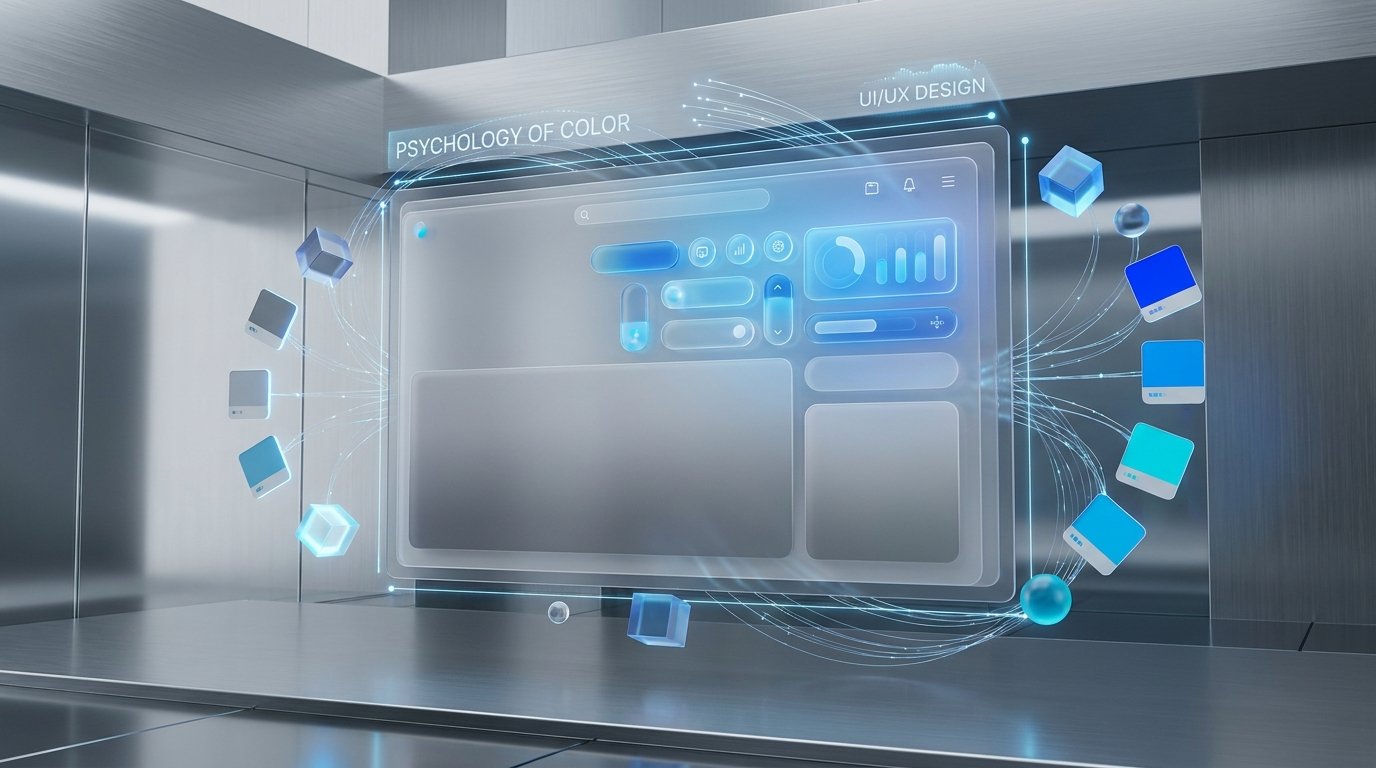
Consider the modern "light theme" aesthetic that dominates top-tier digital agencies and enterprise software. By utilizing a soft, multi-dimensional gray gradient as the primary canvas, designers create a space that feels incredibly clean and architectural. When you pair that soft gray base with strategic, glowing blue accents—such as neon CTA buttons or illuminated borders around frosted glass elements—you instantly communicate cutting-edge innovation and rock-solid trustworthiness.
The gray grounds the design, while the glowing blue directs user action and injects a sense of futuristic energy.
3. Visual Hierarchy and Cognitive Load
Color psychology isn't just about the emotion a color evokes; it’s about how colors interact to create a visual hierarchy.
The human brain is wired to notice contrast. If every element on your screen is competing for attention with loud colors, the user experiences high cognitive load—they don't know where to look, get frustrated, and leave.
Strategic UI design uses color sparingly to guide the user's journey:
Base Colors (60%): Your background tones (like clean whites or soft gray gradients) that hold the structure together.
Secondary Colors (30%): Used for typography and supporting elements to establish readability and structure.
Accent Colors (10%): Your vibrant, high-contrast colors (like a glowing blue) reserved strictly for primary actions, links, and critical alerts.
4. Accessibility Meets Psychology
A crucial aspect of color psychology is ensuring that your choices are inclusive. A beautiful palette is useless if visually impaired users cannot navigate your site.
When crafting emotional, color-driven experiences, modern designers must rigorously test their contrast ratios to align with WCAG (Web Content Accessibility Guidelines). Fortunately, high-end aesthetics and accessibility go hand-in-hand. A brilliantly glowing accent color against a carefully calibrated, muted background doesn't just look cinematic—it also provides the stark contrast necessary for excellent readability.
The Verdict
Color is one of the most powerful tools in a UI/UX designer's arsenal. By moving beyond pure aesthetics and embracing the psychological impact of your color choices, you can create digital experiences that not only look spectacular but also build trust, reduce friction, and drive conversions.
Ready to elevate your brand's digital presence? At RAAQ Designers, we engineer visually stunning, psychologically optimized interfaces that captivate users and deliver measurable results. Let's build your next digital masterpiece.